This year, you might spot Archer Library staff wearing these pins for National Day for Truth and Reconciliation. The feather represents the many Indigenous children who embarked on their journey to the spirit world while attending residential schools. We are honoured to wear these pins in their memory.
This pin was commissioned by Pro Metal Industries, which is owned by Pasqua First Nation, a Saulteaux/ Cree community on Treaty 4.
Next time you’re in the Archer Library, be sure to check out the display case in the computer commons where there’s a retrospective exhibit celebrating the University of Regina Press ‘s 10 year anniversary. On display are books from the library’s collection of U of R Press publications as well as seldom-seen historical photos and documents from the University of Regina Archives.
Data visualizations are the graphical representation of data, typically through charts, graphs, and maps. Data can be overwhelming and much like statistics, visualizations make data accessible and allow us to quickly see trends, comparisons, and outliers. However, while visualizations also make data more accessible, they can make data too simplistic (and possibly misleading). When we look at a visualization, we process images and colours first then text. As a result, visualizations can manipulate even when the data are represented correctly. Recently I’ve been seeing a data visualization from the Government of Saskatchewan on teachers’ salaries. The visualization in question:
Let’s take a closer look and explore what is effective about this visualization and what need improvement.
Effective – The Data Story
Visualizations tell data stories. With the billboard, the data story is that Saskatchewan teachers are the highest paid in Western Canada, earning $1,700 more than teachers in the Western Provinces. To add to the story, the teachers will receive a 7% increase over three years.
Part of what makes a data visualization accessible is they allow key data to be identified and highlighted in a quick format. Looking at a spreadsheet with lines of data can be overwhelming and data trends can be lost. Creating a visualization allows us to see and highlight trends through a visual medium. In the salary billboard, the designers want to highlight Saskatchewan teachers’ salaries as higher than the other Western provinces. This is done through a simple bar graph, three colours, and large numbers. The billboard is very effective in relaying its message to someone who would only see it while driving.
Needs Improvement – Missing Information
Making a data visualization requires carefully balancing the amount of information present on the graphic. Too much information can cause the viewer to miss or dismiss the message. Not enough information makes the creators of the visualization look misleading, biased, inaccurate, or all of the above. For this billboard, too much information would be ineffective given the audience (people driving by) and the amount of time to look at the information (seconds to minutes depending on placement and traffic conditions).
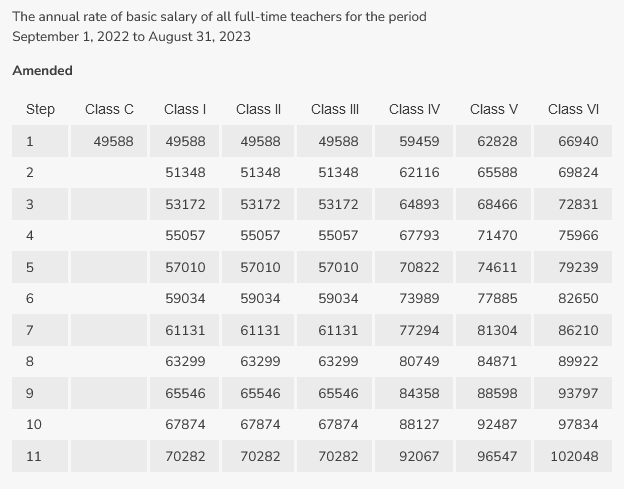
However, a good visualization should always allow the viewer to access the broader set of data (within reason) used to create the visualization. Usually, this is done by linking or including a source to more data. While this is harder to convey on a billboard, it does contain the Government of Saskatchewan website information, but just the Government of Saskatchewan homepage. Going to the website provided on the billboard does not give us any more information on the salary data, which means finding more information requires time and effort to search for the data. It would have been better if a more detailed URL was included for those (like me, probably just me) who are interesting in taking a deeper look. Another piece of missing information is where the numbers come from. The visualization includes the statement that Saskatchewan teachers make 92K annually. Where did that number come from? What does 92K annually mean? Is that a starting wage? How much post-secondary education is required for that wage? How many years of experience teaching lead to that wage? Again, if the billboard had a little more information or allowed viewers a more direct route to the data, we could get the answers to these questions. The pay scale of teachers is publicly available on the Saskatchewan Teachers’ Federation website, which provides a better look at the data. When we look at the pay grid we can see the data more clearly, we can see in the last contract from 2019 to 2023 and if we look specifically at the 2022-2023 pay scale, 92K annually is for teachers with 4 years post-secondary education and 11 years experience. It also shows that 92K annually is the top of the pay scale in terms of increases for experience teaching.
Similarly, we are missing where the data came from for the Western Provinces salary. As Education falls under provincial governments, each province would supply data similar to Saskatchewan with pay scales for each year of a contract. The rational for providing an average for comparison makes sense on a design level for the visualization. The data is to be acknowledged and understood very quickly, as it would be seen while driving past the billboard. Providing the individual provinces might affect the messaging with too many variables and change the impact factor of the graph if one province paid higher than SK. When questioned by the Regina Leader Post, the Government of Saskatchewan explained how they calculated the Western Provinces average. What average did they calculate? Mean, median, or mode? Let’s assume the average was calculated using the mean. The government statement said they calculated the average by looking at wages across BC, Alberta, and Manitoba for teachers at Class IV (four years post-secondary education), step 11 (11 years experience). Since BC, Alberta, and Manitoba have different salary scales based on division, there are many data to review. We would also need to take into consideration that the data points would include large urban centres and small rural areas where teachers’ salaries are influenced by cost of living. So, we would also want to see the range of the salaries to determine if there are any outliers that could skew the mean.
TL:DR – It Needs Work
From a design perspective, the billboard is great. The message is simple, clear, and easy to understand. However, from a data perspective, there’s not enough information provided to tell the data story effectively. The lack of access to more detailed information makes it difficult for those critically evaluating the data to find their answers. In conclusion, if you have more questions than answers when looking at a data visualization, look deeper.
Our last highlighted book celebrating the 10 year anniversary of the University of Regina Press is one of their most noteworthy titles to date, James Daschuk’s Clearing the Plains. This was the first book published by the newly named University of Regina Press in 2013 (prior to that it had been known as the Canadian Plains Research Centre.) It was the Press’ eighth national bestseller and the 2014 winner of numerous awards, including the Clio Prize, Best Scholarly Book in Canadian History, Aboriginal History Prize, and the Governor General’s History Award.
The Archer Library and Archives looks forward to ten more years from the U of R Press!
Drop-in English coaching in the Archer Library is back again for the fall semester! Kady-Ann, the English coach from UR International, will be available in the Pasqua Room (LY 107.1) Mondays, Wednesdays, and Fridays from 10:30 a.m. to 1:30 p.m.
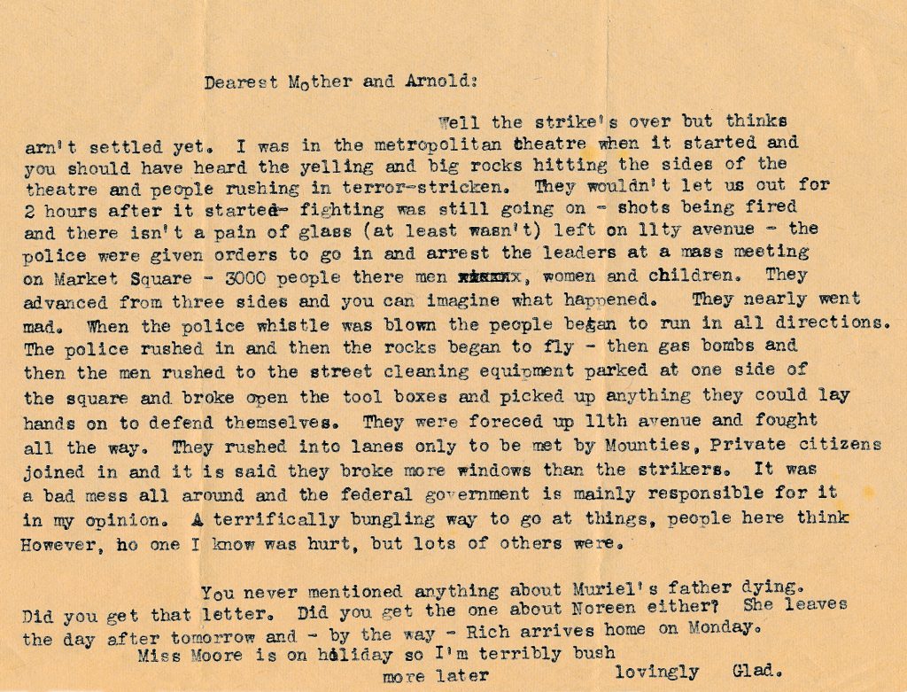
It’s time for another installment of the Association of Canadian Archivists Hashtag party. Today’s theme is #ArchivesLabour. This first person account of the Regina Riot, which was a key event in the 1935 On-To-Ottawa Trek, comes to us from the Gladys Arnold fonds at the University of Regina Archives.